Sunday 11 November 2012

Fine Art


Fine art research..

1. Ai Wei Wei work is rich in metaphor. How would you interpret his Sunflower Seeds? How do you think it's manufacture contributes to our understanding of the work?
At first without research I had no idea- but with research i understood that they were all hand made by Chinese workers and i also found out what their purpose was- Wei Wei wanted the fact that the seeds were common to show that they could trigger memories, they are consumed on holidays, weddings, at movies, during conversations etc, so they were used to show the good times and represent the memories of these times.
I also read somewhere that they had political meaning. Also that they can represent the mass production from China for Western consumption, therefore the manufacture could help our understanding of the work as the seeds could represent all that people that made them and their lives. The fact that they're hand crafted not machine made could show how hard the Chinese work as they are well known for following strict, hardworking lifestyles.


http://www.youtube.com/watch?v=PueYywpkJW8

2. What and where was Sensation and why was this an unexpected venue for the exhibition? Which of it's exhibitors continued to fascinate you?

This was an exhibition of the collection of contemporary art owned by Charles Saatchi. It first took place in 1997 at the royal academy of London and toured to Berlin and NewYork. The National Gallery of Australia cancelled their showing. Exhibitors that continued to fascinate me were definitely Damien Hirst as i love the contriversy that surrounds his work. I also some of his work very interesting and would love to see some of it in person. As well as Hirst, i also found Fiona Rae's worl interesting as i love her style of painting.
Using different techniques/ mediums and objects of observation to create a piece of art.


3. What were the Bauhaus and Black Mountain college? How might they have influenced your current education?
 
Bauhaus- School of design established by Walter Gropius in 1919. It was based on functionalism and simplicity, practical craft and geometric design.
Black Mountain College was in North Carolina. It pushed 'artistic and eductional experimentation' which hadn't been done yet. After the Bauhaus shut because of the Nazi's it moved to America.
I feel it influenced current education as it revevlutionised the way art was taught, it pushed it to the next level which was then passed on. The styles they created influence all aspects of art- fashion, 3D etc so there's an influence there as well.
 
4. Both NVA and YesYesNo created major light installations this summer. Who are they and what did they do? How would you feel about making art as part of a consortium
NVA- company that create landscape installations
YesYesNo are a company that create interactive intallations
 
I think that art as part of a consortium is a great thing as it allows you to share skills/ knowledge
it also reduces the risk as 2 companies are involved and it can help to make a project stronger. Obviously these two companies would benefit greatly from each others know how and it would mean that can make better art.
 
This question also leads onto another part of my fine art research. We were asked to find a Fine Art book from the library and say why we liked it. After looking through book af
 looking through the book so interesting. I loved the idea of putting on a art show against a hillside or beautiful landscape for everyone to see and thought it was also a stunningly presented book with great photography.


My Fine Art work


This was the area that i was most interested to see what i thought of as i thought it could be a potential degree choice. However after the first hour i'd already decided it wasn't for me as when we were defining the area of  'Fine Art' on of the main points that stood out to me was that fine art was art that doesn't have a purpose. And after thinking about this i realized simply that if something doesn't have a purpose- then whats the point in it? Obviously it can be that its point is to get a 'deep meaningful message across' but after looking at some of the artists of research i found that often these messages were so hidden or tenuous that the pieces become completely irrelevant. I like art that does something or has a practical function.. despite the fact i enjoyed creating the pieces.

Applied Art

 
1 Inspiring Artist- Thomas Heatherwick


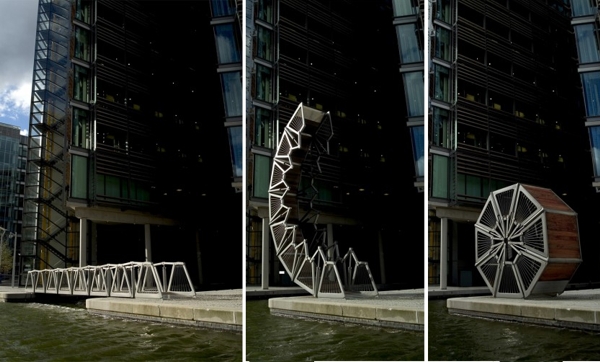
From the artists we were given to research i was most inspired and intrgued by Heatherwick's work. It is clear that his designs are fair from boring or ordinary and they are full of creativity and talent. Many of his designs are not only beautiful, but also practical and function in some way, for example 'The Rolling Bridge' which is the only one of it's kind is such a clever creation and lives up to it's name perfectly. The Olympic cauldron was the first time i actually heard of Heatherwick. His design for the cauldron was so incredible and really showed the extent to his talent and vision.
 
 
Following our research and before we stated experimenting in this area we were asked to write what we feel that Mixed Media Applied arts is. From the name of the artistic area i would say that it is art that you create using your 'application' of skills with materials and processes to create an object, often for use. It can include many different Medias for example wood ceramics glass metal. You would start from a design process then perfect the design before you create the piece of art. It is different to fine art as this art has a function whereas fine art often doesn't. Simply from looking at artists work and the definition of applied art i find the area very attractive as i love working in a hands on way to create something technical with a funtion and purpose.
 
We started off looking at different objects and overlapping 2 or more drawings to create different shapes. i thought it was an effective way of finding inspiration as you may come up with a shape that you wouldn't otherwise have thought of .


Small experiments with the different equipment, materials and techniques.


With a cube of wood we then created different patterns or shapes using types of metal and several different machine techniques. This was something that i really enjoyed and showed me that i have more fun actually making things in a hands on way. I was happy with the result of the experimenting and the wooden block. I liked how each side was completely different and had a completely different style.


One of my favourite areas so far. I loved how hands on and practical the work was and it was really fun to experiment completely with what we wanted.

Understanding Graphic Design


Design Museum in London

Alan Fletcher-

Alan Fletcher's work stood out to me as the simplicity of some of his designs caught my eye. I also thought his clever use of Typography was very effective.


The wet paint design was definitely my favourite. I loved the use of colour and clever use of typography to express the words


Stefan Sagmeister
 
 
What i loved about this design is how fresh it seems. The beautiful photography teamed with the words and the message Sagmeister was trying to convey is very effective, the colours work well together and i think the design as a whole is really simple yet so effective.
 
Kris sowersby
I love the intricacy of this type. The detail is what made it stand out to me and i really appreciate the complicated pattern and clever style of this typography.
  
Pep carrio

The main thing that attracted me to this book cover was the use of texture. I hadn't yet come across much when researching graphic designers and i think it really adds to the effect of the design and makes it more interesting and fits well with the fact that it's a foot print and overall makes the image more powerful. 
 
 
Noma Bar
 
 
This Design by Bar clearly stood out. The bold use of colour and simplictiy really shows her style. I wasn't a massive fan of all of her work however this one really shows the power of a simple design.
 
An Article of Interest
 
 After taking this magazine out of the library i spent some time thoroughly reading it. Many of the articles were inspiring, for example one showed you how to take a simple bold black word and instructed you step by step how to turn it into an incredibly beautiful design using drawing and Photoshop.

However, the article that i spent most time looking at was actually a summary of the top 200  design moments so far. I think the reason i found it so interesting was because there were some really well known grpahic designs featured in the article, designs that I hadn't previously thought of as being iconic or having an impact on the design world but after reading the article i realised that wasn't the case. It talked about the impact of different logos, editing software and illustrations and made me realised how effective some of them have been.


 http://www.computerarts.co.uk/shop/magazines/computer-arts/may-2012-200

Graphics


6 Words:

Collapse
Detached
Cascade
Fuse
Slither
Stability

First part of the process- looking at colour.


 Fonts and writing styles that symbolise and represent the word. I personally really enjoyed doing this. I loved creating each different style and while some words i had less inspiration about i thought this was all part of the challenge.


The next stage was creating abstract images from magazines based around the colour schemes i came up with for each word

Detached


This would my favorite representation of the word detached. i felt the colours showed the mood and atmosphere of the word and the set up of the images could be seem to also represent the word. I think overall its one of the most effective images i created however had i had more time i would have liked to add text.


Slither


Stability


I found stability quite hard to represent and  wasn't particularly happy with the two images i came up with- I don't think they are that effective or that creative and i would like to try and take then further maybe by editing on Photoshop and by adding text.


Collapse


Fuse


 Out of the backgrounds I created I was happiest with fuse. I think the colors and shapes worked well together to represent the word, and it was the image I wanted to take further improve on Photoshop and make more effective as I felt it would create more of an impact with more work.

Copying fonts and combining ones i thought were relative with words they matched.


After combining the writing and editing the initial picture on Photoshop i was very happy with the final image. I also really enjoyed creating each separate section of the picture- Photoshop definitely being my favourite simply due to the fact that there are so many ways to enhance and alter something simple and take it in any direction.